
TL;DR

Get decor and gifts delivered free with Prime
- Fast, free delivery on millions of items
- Prime Video, Amazon Music and more included
- Member-only deals all year
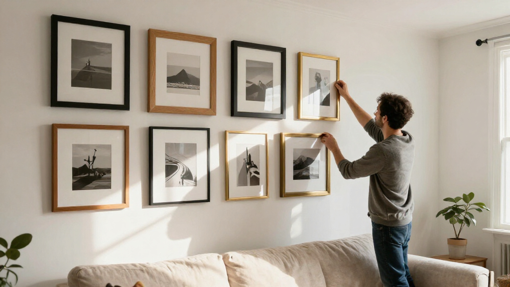
Toronto framing expert Tara Gavin says a gallery wall can feel more intentional through coordinated frame and mat colors, varied photo placement and considered negative space. In a project for a Toronto family, she used burgundy, oak and black details and black-and-white photographs to create cohesion on a narrow wall.
Framing expert Tara Gavin, founder of Toronto’s On the Wall Framing, says a gallery wall works best when its frames, mats and images follow a clear design direction. A project she curated for a Toronto family of five shows how a mix of burgundy, oak and black details, alongside black-and-white photographs, can bring cohesion to a display fitted into just 31 inches of wall space, according to House Beautiful.
Gavin’s advice is less about following a fixed layout than making deliberate choices across the whole arrangement. In the House Beautiful report, she describes her team’s use of different scales, unexpected mat colors and varied frame finishes, as well as changing how photographs sit within their frames. Those decisions, she says, help a display feel considered rather than like a collection of unrelated pieces.
For the Toronto project, design studio Kessler Levitan asked Gavin to curate a gallery wall for a family of five. The available wall was only 31 inches wide. Rather than relying exclusively on white mats and wood frames, Gavin kept some oak and black frames and introduced burgundy-colored mats and frames to the composition.
She describes the burgundy as adding warmth, while the oak stops the display from feeling too formal and black frames add contrast. Her broader suggestion is to select a mat or frame color that connects with a noticeable shade in the room. Rich burgundy, soft blue, olive green and warm neutrals are among the alternatives she names to white.
Gavin also treats the mat—the space between an image and its frame—as part of the composition, not just a border. More negative space can draw attention to a small photograph. Where a frame allows it, she says, multiple images can share one frame; photographs can also sit slightly off-center instead of always being placed in the middle. These are options rather than rules, and the arrangement should be tested for the particular images and wall.
For the featured family display, Gavin printed the photographs in black and white while using color in the mats and frames. She recommends that approach when photographs were taken in different lighting or have noticeably different color palettes. Converting them to monochrome can make the images read more consistently together, though she does not present it as necessary for every gallery wall.
Design Choices That Tie the Wall Together
The advice matters to readers because family photographs often come from different years, devices and settings, making a wall display visually uneven even when the images are personally meaningful. Gavin’s approach offers a way to address that mismatch through presentation choices rather than requiring a collection of professionally produced art or identical frames.
Her example also shows how a small or narrow stretch of wall can be treated as a planned display instead of a limitation. Using a related palette and consistent photo treatment can help disparate images feel connected, while varied mats and frame finishes preserve visual interest. These are design recommendations from a framing professional, not guarantees that one color scheme or layout will suit every room.
Products Worth Considering

Bose SoundLink Flex Bluetooth Speaker (2nd Gen), Black

Bose SoundLink Plus Portable Bluetooth Speaker, Black

Dyson W1 PencilWash Cordless Wet and Dry Floor Cleaner with Dock
As an affiliate, we earn on qualifying purchases.
A Narrow Wall, a Deliberate Palette
House Beautiful’s report centers on a single residential project rather than a study or a formal set of universal design standards. Gavin, founder of On the Wall Framing in Toronto, worked with design studio Kessler Levitan on a wall for a family of five. The article identifies the available width as 31 inches and presents the finished composition as an example of making a constrained space a design feature.
The project’s visual strategy combines a limited group of frame colors with black-and-white images. That distinction—color in the framing, monochrome in the photographs—is central to Gavin’s explanation of how she balanced variety with consistency. The report does not provide dimensions for each frame, a full hanging plan or a complete materials list.
““My team and I love playing with scale, unexpected mat colors, different frame finishes, and the way photographs are positioned within a frame in order to keep them fresh.””
— Tara Gavin, founder of On the Wall Framing, as quoted by House Beautiful
Limits of the Project Advice
The report offers Gavin’s professional perspective and details one project, but it does not establish that her approach is the right choice for every home. It does not include a complete image inventory, exact frame dimensions, a measured spacing plan, or a step-by-step hanging method. The source also does not give a publication date in the supplied material.
It is not clear whether the family selected the palette or how the display looks alongside the room’s furnishings beyond the description in the report. Gavin presents black-and-white printing as a way to create consistency, not as a requirement; whether it suits a particular collection depends on the images and the intended effect.
Planning a Wall of Your Own
The report does not announce a follow-up project or a coming development. For readers applying Gavin’s advice, the practical next step is to decide on a visual direction before choosing individual frames: identify a color already present in the room, consider whether mixed photo colors need a consistent treatment, and test how mat width and image placement affect the overall arrangement. The source gives no prescribed hanging sequence, so exact spacing and layout remain matters for each wall.
Key Questions
What does Gavin mean by giving a gallery wall a design direction?
She means making related choices across frame finishes, mat colors, image scale and photo placement, so the pieces read as a planned arrangement rather than a collection of unrelated frames.
Does a gallery wall need white mats and wood frames?
No. Gavin says those are a familiar option, but suggests considering colors such as burgundy, soft blue, olive green or warm neutrals, particularly if they connect with the room’s furnishings.
Why print family photographs in black and white?
Gavin says monochrome printing can help photos taken in different lighting and with different color palettes feel more consistent together. The report presents it as an option, not a rule for every display.
How can mats change the look of a gallery wall?
A mat adds negative space around an image, which can give a small photograph more emphasis. Gavin also suggests trying multiple photo openings in one frame or placing an image off-center.
What was distinctive about the Toronto family project?
The project had only 31 inches of wall width. Gavin used burgundy, oak and black framing details and black-and-white photographs to create a coordinated display for the family of five.
Source: rss